Hurst Bands – J.M. Hursts Indicator Review
Hurst Bands Indicator Review for binary options. An indicator from a rocket scientist for trend traders. The good news – it doesn’t take a rocket scientist to use!
Hurst Bands – J.M. Hurst Indicator Review
Hurst was an engineer, a rocket scientist to be exact, before he became a trader. I suppose sometimes you do need to be a rocket scientist to create an indicator. Hurst analyzed the price action of stock markets back in the 60’s. After a long and detailed analysis he published “The Profit Magic of Stock Transaction Timing” which is a book on market cycle analysis. His cycle analysis is considered complicated and hard to understand for the average trader but thank goodness the indicator isn’t. Who knows, maybe some alien technology was involved… you know, the Roswell incident was just a decade before Hurst revealed his strategy. Conspiracy theories aside, you don’t need to understand the intricate “alien-rocket scientist math” behind it and you don’t have to be a genius to use the Hurst bands!
What is the Hurst Bands Indicator?
This tool is also known as the Hurst channels tool. At first sight, it might resemble the Bollinger bands because it consist of three bands, upper, lower and middle band. It’s not a standard tool, to use it you have to download the Hurst Channels and insert it into your MetaTrader. The version I found can be downloaded at the bottom of this page. If you are not sure how to set up a custom indicator read this forum thread on how to do it.
When you insert the indicator into your charts, you should see three lines. If they are too far away from the candlesticks, you can tweak the settings under “Input”. The “Prd” (period) and “Ecart_Pips” are the two variables that you can change. I set mine to 50 for both. The bands are calculated using Average True Range and displayed based on a multiple of that figure, typically twice the ATR.
It should look something like this when you are done: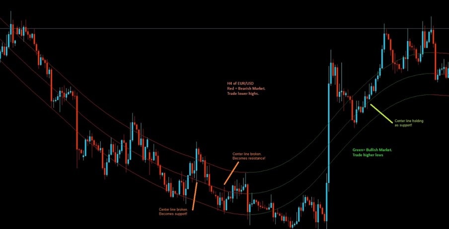
Red areas indicating a downtrend. You can notice that the upper line has adapted well to the lower highs in the down trend. The green lines indicate an uptrend but due to news events the candles are completely outside the bands at some areas but still do work as support at a higher low.
So how do you trade this? It is as simple as it looks in the picture above. If the asset is in a down trend, you will see lower highs. If these lower highs retrace up to the upper band, you go with the main trend and take a put option. If you are in an uptrend, you should see higher lows that bounce off of the lower band. Don’t get too focused on the colors of the bands. This is a custom indicator and the colors take a while to confirm so as I said, stay concentrated on the highs and lows!
You can even trade the middle line if you like the extra action. For example, see in the price above when price crossed the middle line it either became support or resistance. It is up to your risk appetite whether you trade the ones in the direction of the trend or counter trend trade. I would advise against the latter. Overall, if you scroll back on your charts and are familiar with price action, you will notice that the Hurst Bands adapts quite well to prior support and resistance areas! That is impressive.
Why does the Hurst Band Suck?
One major disadvantage is also illustrated in the picture above, it does not work well unless market is clearly trending. If you look at price dumps or jumps during news or for example, at the moment of writing, during Brexit: you will notice that price is all over the place and either above or below the bands. It’s just a big mess. But then you look back at trending areas with decent lower highs or higher lows and the bands look great again. Furthermore, adjusting the value of the bands can be tricky. Oh, and don’t even get me started on the whole rocket scientist math story…
Why doesn’t the Hurst Band Suck?
It doesn’t suck if you simply follow the trend and have some prior knowledge of price action trading as in drawing support and resistance lines, trend lines and basic candlestick knowledge. The bands are actually pretty accurate when comparing to hand drawn support and resistance lines.
Doesn’t Hurt to try the Hurst Bands
Yes, it’s tempting to go on with the “but it’s not rocket science” remarks but really, those were some simplified rules to follow, right? For the very novice traders I suggest an additional indicator to help confirm the highs and lows for entries! Stochastic, RSI or whatever you prefer. I took some time to look at the previous history and how the bands were plotted in relation to the candlesticks. Just as I mentioned earlier above, they are pretty accurate. Thanks to this accuracy, I believe you could say that the Hurst bands are a good mix of support and resistance lines with trend lines. In addition, I also found out that they are very similar to moving averages because switching the time frame shows the lines on different price levels. I don’t see this as an issue personally but for beginners it could be somewhat confusing. But hey, it doesn’t hurt to give it a shot!