Traders’ Dynamic Index – The Indicator That Turns Mess into Clarity
I’m not going to lie to you, this one is complicated, so you’d better get a cup of coffee. As the title suggests, we are going to talk about the Traders’ Dynamic Index or better known as the TDI. When I first came across this indicator, many people were using it with success but I couldn’t wrap my head around it and I found it too complicated, with too many lines and mixed signals. Although all the complicated lines are still there, now I look at it differently and I understand its usefulness. Let’s see if I can explain it to you.
How To Use Traders’ Dynamic Index
The indicator, as I said, has a lot of lines that might look like spaghetti at first so let’s start with a picture and I will explain using that picture:
Notice the two Blue lines which tend to contain all the others – these are volatility bands, similar to Bollinger Bands. For more info on Bollinger Bands, check out this article: Bollinger Bands©: The volatility tool
The Green line is a Relative Strength Index (RSI). You are probably familiar with this indicator but in case you want a more in depth explanation, read this article: Relative Strength Index – Old School is Good School!
The Red line is called the Signal Line and it’s basically a Moving Average which will help identify a good entry setup.
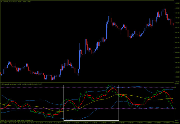
And now we get to the most important line, the one that ties everything together and makes the indicator tradable: the Yellow line. This is called the Market Base Line and it acts as a trend indicator. All the signals from the other lines will be traded only if the Yellow Master says it’s okay. Here are some potential scenarios: when the Green is above the Red and both are above the Yellow, we will trade with a bullish bias. When Green is below Red and both are below Yellow, we will trade with a bearish bias. Now let’s add the Blue Bands in the mix: if the market is NOT in a strong trend, the bands will act as overbought/oversold indicators. In other words, when the Green line touches them, there’s an increased chance of a reversal or at least a retracement. Ok, you are probably halfway through your cup of coffee, I am about halfway through this explanation and from now it gets easier… sort of. We are going to learn how to approach a trade
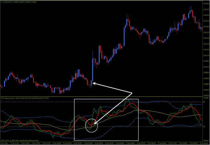
First of all, you have to take a look at the Yellow line. That’s where you start. Look at the rectangle in the picture above and notice the Yellow line is clearly moving upwards so we are in an uptrend and we only look for bullish trades. Now remember the paragraph above when I said that for a bullish trade (Buy if you are trading CFD/FX and Call if options are your thing) we need the Green to be above Red. Can you spot the trade? Yep, the crossover! Look below:
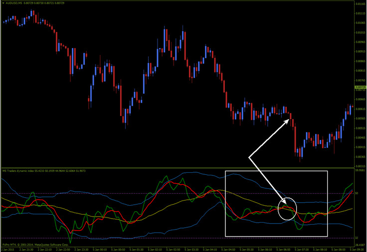
Of course the opposite applies for a bearish trade (Sell if you are trading CFD/FX and Put if you are trading BO): The Yellow must be moving downwards and the Green must cross below the Red:
This is pretty important: I usually wait for a Red/Green cross which occurs close to the Yellow line. If you enter the trade before, it might be too soon. Also, look for clear crosses. Look at my picture above and you’ll see that the Green and Red lines crossed once before my circled zone. However, that cross is almost flat and the lines are too far away from the Yellow line.
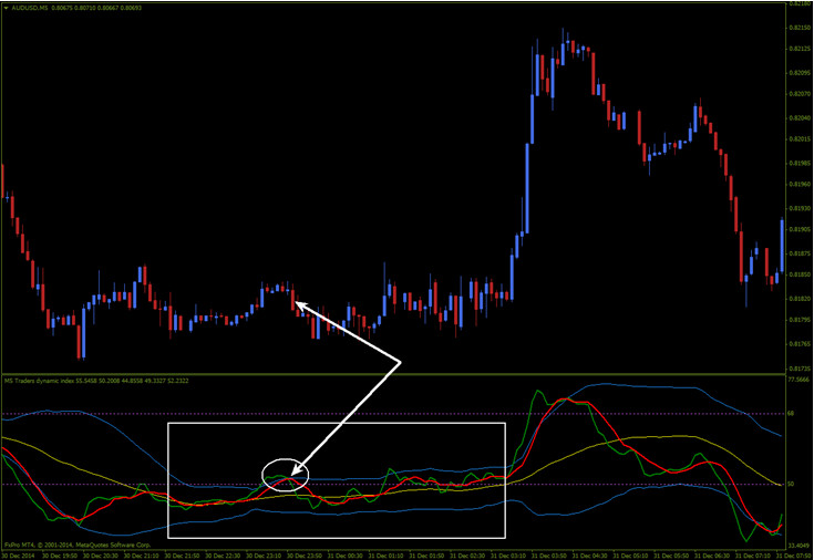
If the market is without clear direction and the Yellow line is flat, trades can be taken in both directions but only if the Green line goes outside the Blue bands and then crosses the Red, coming back inside. Trades will be taken in the direction of the cross, just like in the pic below but to be honest I’d recommend staying away from such trades.
Why Does The TDI Suck?
Eh, that question is simple: it sucks because it’s hard to learn how to use it. What I’ve written so far might help, but you still have to put it on a chart and stare at it long enough to understand its movement. Even after you get familiar with it, false signals will still be there because the lines cross many times so you need to have a lot of patience before pulling the trigger on a trade. To overcome this disadvantage, I have modified all the settings of the indicator but don’t go there if you don’t know what you’re doing. The indicator in the pictures above uses default settings.
Why the TDI doesn’t Suck?
Simply because this indicator shows you at a glance what condition the market is in. It shows momentum, volatility, and direction all in one window and this frees up space which would otherwise be occupied with other indicators. But the fact that it frees up chart space is not the main strength of the TDI. Its complexity takes first place when it comes to TDI’s strengths.
Wrapping It Up – Using TDI For Different Types Of Trading
Although the TDI is mainly used by Forex traders, it can be used just as good for trading Contracts for Difference, Crypto or even BO. The rules of trade opening remain the same with all these trading types, just remember to switch Buy/Sell with Call/Put if you are trading BO. The TDI is an adaptable tool that shows the state of the traded instrument and obviously there will be differences between the charts of USD/CAD, Gold and Bitcoin, so you need to identify those differences and adapt to the particularities of each trading instrument.
Downloads Available:
- Traders’ Dynamic Index Indicator Download