The Chart Patterns Tool – Follow the Money!
Review of the Chart Patterns Tool for Binary Options Trading
We often talk about the trader’s Toolbox which is basically our knowledge base and contains all the indicators we know about or we ever used. Of course, it’s a metaphorical Toolbox but have you ever used a real toolbox – you know, the one where you keep your wrenches, screwdrivers and similar things? If too many tools are stuffed in there, it will be more difficult to find the one you need and sometimes you will spend more time looking for the hammer than actually hitting nails on the head. That’s exactly what can happen with the trader’s Toolbox, especially if too many tools/indicators are used at the same time. So let’s see if we can do something to clean our charts and get rid of most of our indicators with the use of chart patterns (Follow up to Chart Pattern Tool Intro).
No Clutter – Just Price
Many of you may have heard of chart patterns but nonetheless, let me explain what they are so everybody is on the same page: basically they are shapes that price “draws” on a chart and over time, traders noticed that more often than not they have a predictable outcome. In other words, if we correctly identified a certain pattern, we have an increased probability of knowing the next direction of price and the time when it will start to move in that direction. Yeah, I know it sounds great, but notice I used ”more often than not” instead of “always” so don’t sell your house to trade binary options. Let’s start with some of the most commonly used chart patterns:
This is the basic idea behind what they are, how they are formed, and why they are tradable; basically the fundamental principle of technical analysis. The market is made up of people. On an individual basis people are smart. The market is made up of the smartest people in the world and they, one person or another, know everything there is to know about the market and that knowledge is represented in the charts. In a group, especially when money and emotions are involved, the mob mentality takes over and people are dumb. The mob, when it is whipped up to a bull frenzy or a bear fright, will repeat itself when it begins to move higher or lower. This movement, these repetitions, are the price patterns that appear on the chart and the signals we look for in the indicators. The patterns are measurable and predictable with easy to project targets, making them a great source of trading signals.
When it comes to the market, 90% of the time it is just floating along randomly and at those times the signals are weak, trends are ephemeral and price patterns are tricky. It’s those 10% of times when the market is moving that we really care about. Those times the signals are strong, the trends are clear and the price patterns are very, very tradable.
There are two basic types of price patterns; continuation patterns and reversal patterns. This sounds a lot like Japanese Candlestick signals I know, and they are similar, but they are not quite the same thing. Candle signals are, in general, much smaller than a “price pattern”. In fact, there may be several candle signals within a price pattern confirming the tops and bottoms that form the pattern. A reversal pattern indicates the end of a rally or a bear market and the possible reversing of trend, a continuation pattern occurs during a trend and gives indication that the trend is strong and will continue. Basically, the patterns reveal that assets are changing hands and who is in control of the market.
Now, like with just about every form of technical analysis, price patterns are affected by time frame. A pattern in a short term time frame like 5 minute charts is not as strong as the same pattern when it forms on a daily or monthly chart. At the same time the size and scope of the pattern can have an affect on the time frame of the trading opportunity. A Head & Shoulders Reversal Pattern that forms in 2 or 3 weeks is not the same as one that forms over the course of 2 or 3 months, the same way a flag that forms in only a few days does not give the same signal as one that forms over a few weeks.
In order to trade the patterns effectively you must do two things. The first is to measure the pattern. How tall is it? How many days did it take to form? The second is to wait for a break out confirmation. Just because you see a pattern forming does not mean it is a good signal, the signal comes when the market breaks out of the pattern, confirming the analysis. When that happens it is time to enter a trade, using the measurements as a basis for your expiry. This is how it works. If it a market rallies for 2 weeks before a continuation signal it can be expected to rally for 2 weeks after. If the rally was worth 200 pips in the first half, it can be expected to be worth 200 pips in the second half. In the case of double tops and Head & Shoulders reversals, as well as the larger triangle patterns, the magnitude of the patterns is key. If the height from the baseline/neck to the highest/lowest peak is 200 pips you can safely expect the break out move to be worth 200 pips as well, or however many pips the pattern is, you know what I mean.
Double Top/Bottom
This is considered a reversal pattern so when it is formed, we expect price to go in the opposite direction once the pattern is confirmed. Remember, no confirmation no pattern. Of course, chart patterns cannot be explained without pictures so here you go:

As you can see, a Double Bottom indicates that price will go higher once the second bottom is formed and a Double Top suggests that price will go lower. To correctly identify a Double you need to draw a perfectly horizontal line between the two tops or bottoms. Usually trends can end with a Double Top/Bottom and I can honestly say this is one of my favorite patterns, mostly because it is so easy to identify and has a high reliability.
Head and Shoulders
This is another reversal chart pattern which usually appears at the end of an uptrend and it was named like this because of its resemblance with… guess what… a head and two shoulders:

Excuse my burst of creativity but I couldn’t help it. Once you are done laughing at my drawing skills, notice how price reverses once the Head and Shoulders pattern is completed and for that to be the case, we need a Top (head) and two lower highs (shoulders), each on one side. It doesn’t really matter if the shoulders have the same height or one is lower than the other. Trades are usually taken once the neckline (diagonal black line on my chart) is broken to the downside. The Head and Shoulders pattern has a twin brother named Inverse Head and Shoulder which looks the same except its Head is the lowest point and the Shoulders are higher… so it looks like this J:

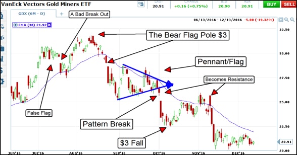
Bearish/Bullish Flag and Pennants
After two reversal patterns, we need a continuation one, don’t you think? That’s exactly what this pattern indicates: a potential continuation of the initial trend. And it is pretty easy to spot: a Bearish flag looks like a move up in a downtrend and a Bullish flag looks like a move down in an uptrend. The patterns signals that the trend will continue and will likely go as high/low as the height of the flagpole. The flagpole is the rally leading up to the flag pattern. Confused yet? This will clear the fog:

Remember, the Bearish (or Bear) Flag always appears in a downtrend and trades are taken once the lower part of the pattern is broken, signifying trend resumption. Same idea works for the Bullish Flag but trades are taken when the upper part is broken. Here’s one:

Pennants, and flags, are areas of consolidation with a trend and are considered to be a shorter term pattern. Pennants are horizontal areas of price congestion, usually with a narrowing range that forms a right pointing arrow when you draw support/resistance lines. It is confirmed with a break in the direction of the prevailing trend, the break out move can be assumed to go at least as high as the move leading up to it. In this example notice how there are two dark cloud covers confirming the top of the pennant range.
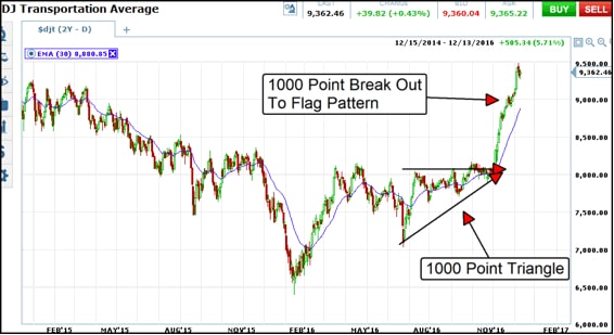
Triangles are similar to pennants but are typically a much longer pattern to form and one with longer term implications. Triangles can be categorized into 3 groups; Symmetric, Ascending and Descending. A symmetric triangle looks exactly like a pennant, only much bigger, months instead of days or weeks and can form in either an uptrend or a downtrend. The ascending triangle appears in an uptrend and has a flat top with a sloped lower edge. The descending triangle forms in a downtrend and has a flat bottom with sloped upper edge. They, as a group, are considered to be continuation patterns.
That’s about it for today’s pattern talk… oh, wait, do these pattern Suck or not? Almost forgot…
Why Chart Patterns Suck?
One of the main disadvantages of chart patterns in general is their subjectivity: sometimes different traders see different shapes and what may look like a complete Head and Shoulders to me, may seem incomplete to you. This also applies to trend lines, Fibonacci levels and probably to all tools that require discretion. Don’t think about chart patterns like some sort of infallible barrier in front of price or perfect indication of future direction; I’ve said this before but I will say it again with the risk of sounding like a broken record: no tool should be used on its own, so combine chart patterns with support and resistance levels or with other indicators and always wait for confirming break outs.
Why Chart Patterns don’t Suck?
Pattern identification is one of the oldest tricks in the book and it’s based on the idea that history repeats itself which is the basis of technical analysis so “more often than not” price will go in the direction indicated by the chart pattern. Similar to Fibonacci levels, chart patterns are a self fulfilling prophecy: the more people use them, the more price will respect them. Probably the best thing about them is the fact that your charts will look less cluttered and you will finally be able to pay more attention to what really matters: price.
Hitting the Nail on the Head
Throughout my trading, I cannot say I relied heavily on chart patterns, but I pay attention each time a clear pattern is forming, mostly because I know other traders keep an eye on them so price is likely to react when a Double Top or any other important formation is completed. To wrap it up: it never hurts to learn something new, especially about the field of trading which is apparently of interest you if you got to the end of this long article. Once you’ve seen them in action, you can decide for yourselves if you will use them or not.
Discuss the Chart Pattern Recognition Indicator on our CommuniTraders Forum